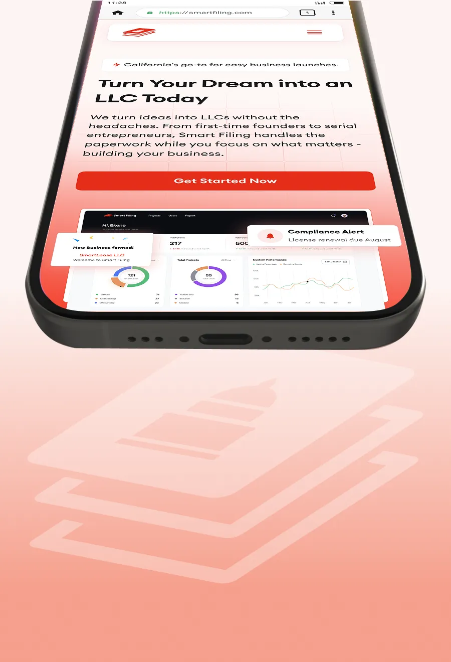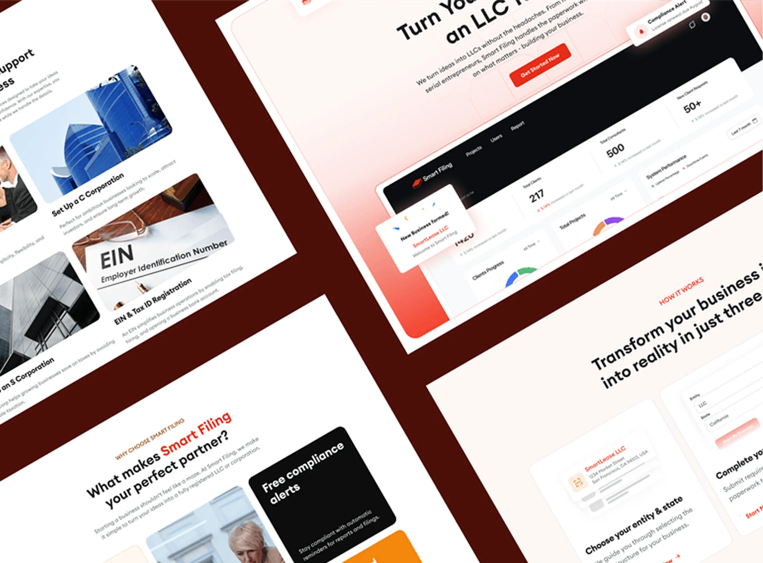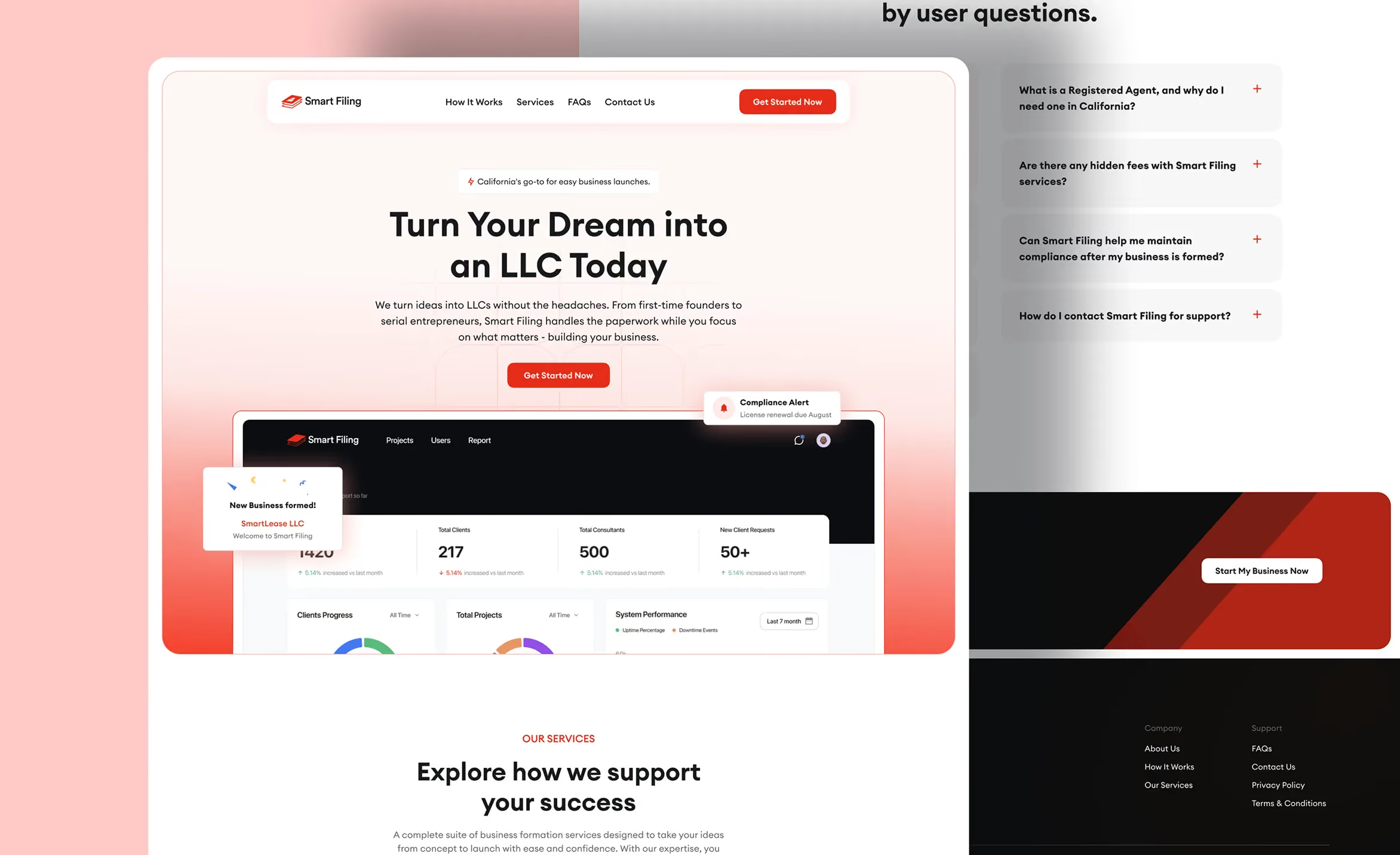
Smart Filing Platform

Starting a business shouldn’t feel like cramming for a law exam. Smart Filing exists to take the stress, confusion, and guesswork out of business registration; especially for first-time founders.

Product Design
Web app
Product Strategy
Visit live site
Smart Filing platform case study cover
01/ Where first time founders got stuck

Where things were breaking‍

‍

Smart Filing had a solid mission and the right services, but the experience didn’t quite live up to the promise.

‍

New users, especially non-technical founders — were getting stuck early in the process. Drop-offs were common during entity selection and form-heavy steps. The product assumed too much prior knowledge, leaned heavily on legal language, and didn’t always guide users when they needed reassurance the most.

‍

In short: the platform worked, but it didn’t "feel" friendly or confidence-boosting.

Role
Product Designer & Strategist
Duration
6 weeks
Deliverable(s)
Logo, full website, and web app
Tools
Figma, Prototyping, User Research
02/ Mapping every drop off in registration

Understanding the real problem

‍

Before touching UI, I focused on understanding where things were breaking.

‍

Here’s what informed the design direction:

  • Conversations and feedback from founders trying to register businesses
  • Reviewing drop‑off points across the registration flow
  • Studying competitors like LegalZoom, Incfile, and ZenBusiness
  • Internal stakeholder insights on operational bottlenecks

‍

A clear pattern showed up: users didn’t mind complexity — they just didn’t want surprises. They wanted to know what was coming, why it mattered, and whether they were doing things correctly.

Smart Filing platform research and discovery
03/ Clarity over cleverness

Defining the Experience

‍

The design direction focused on three core principles:

‍

  • ‍Clarity over cleverness — Every screen should answer what it is, why it matters, and what to do next.
  • ‍Progress builds confidence — Users should always feel like they’re moving forward.
  • ‍Support without hand-holding — Helpful explanations without overwhelming users.
Smart Filing platform design direction
Smart Filing platform solution overview

Some of my favorite screens

Smart Filing platform featured screen 1

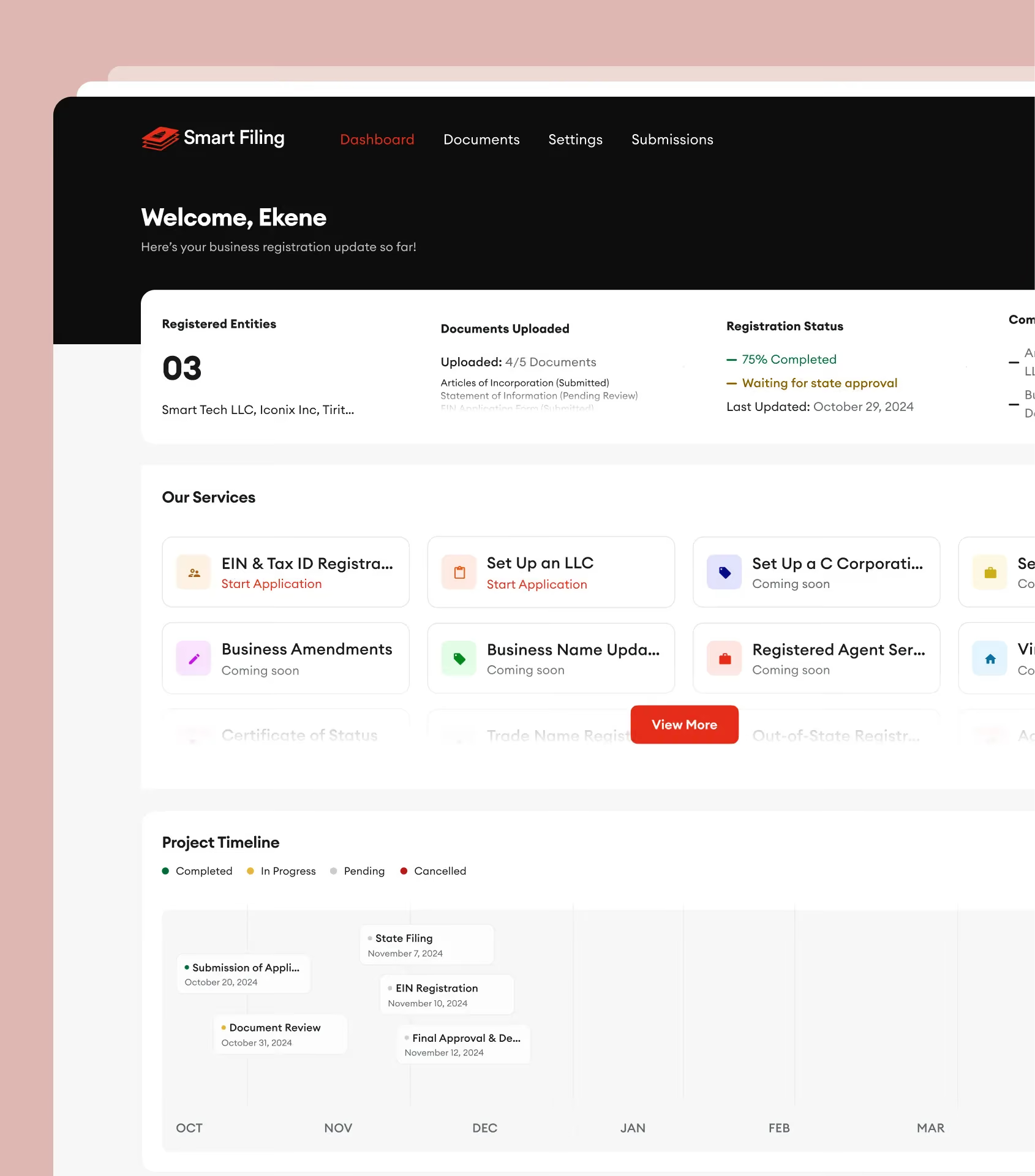
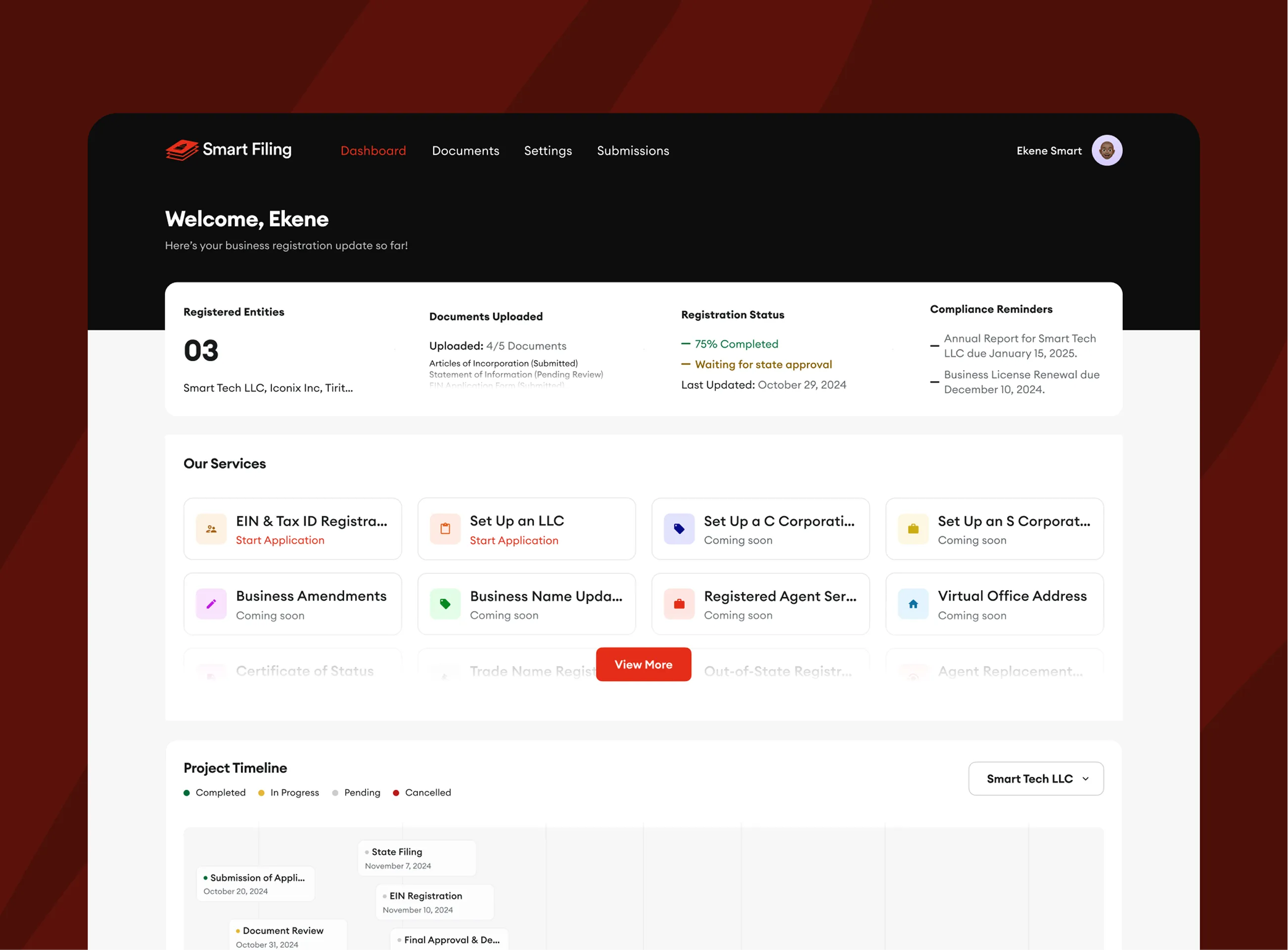
Founder Dashboard

‍

A central place where users can:

  • Track their registration progress
  • See completed vs pending steps
  • Access documents and updates

‍

The dashboard removes the “what’s happening?” anxiety and replaces it with visibility and control.

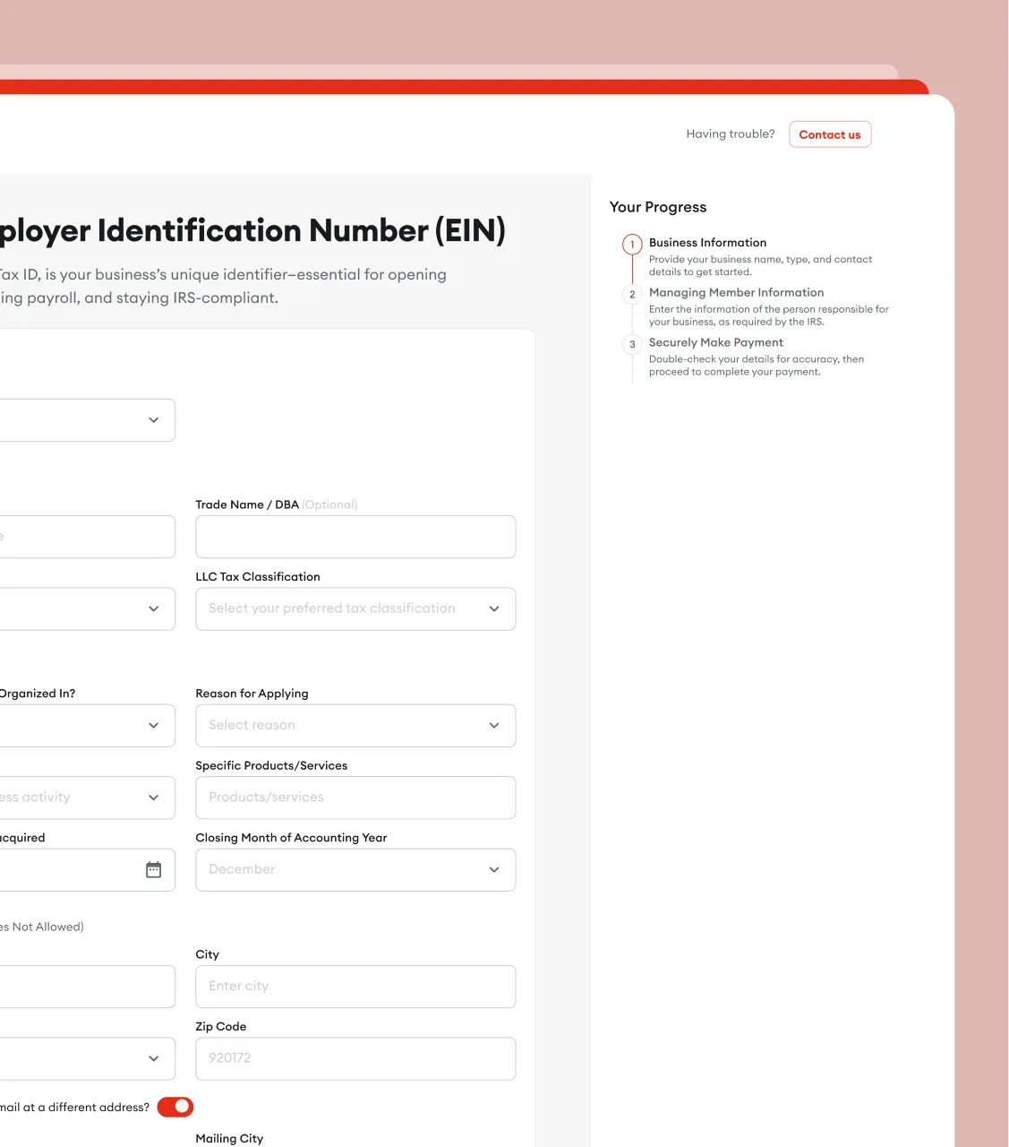
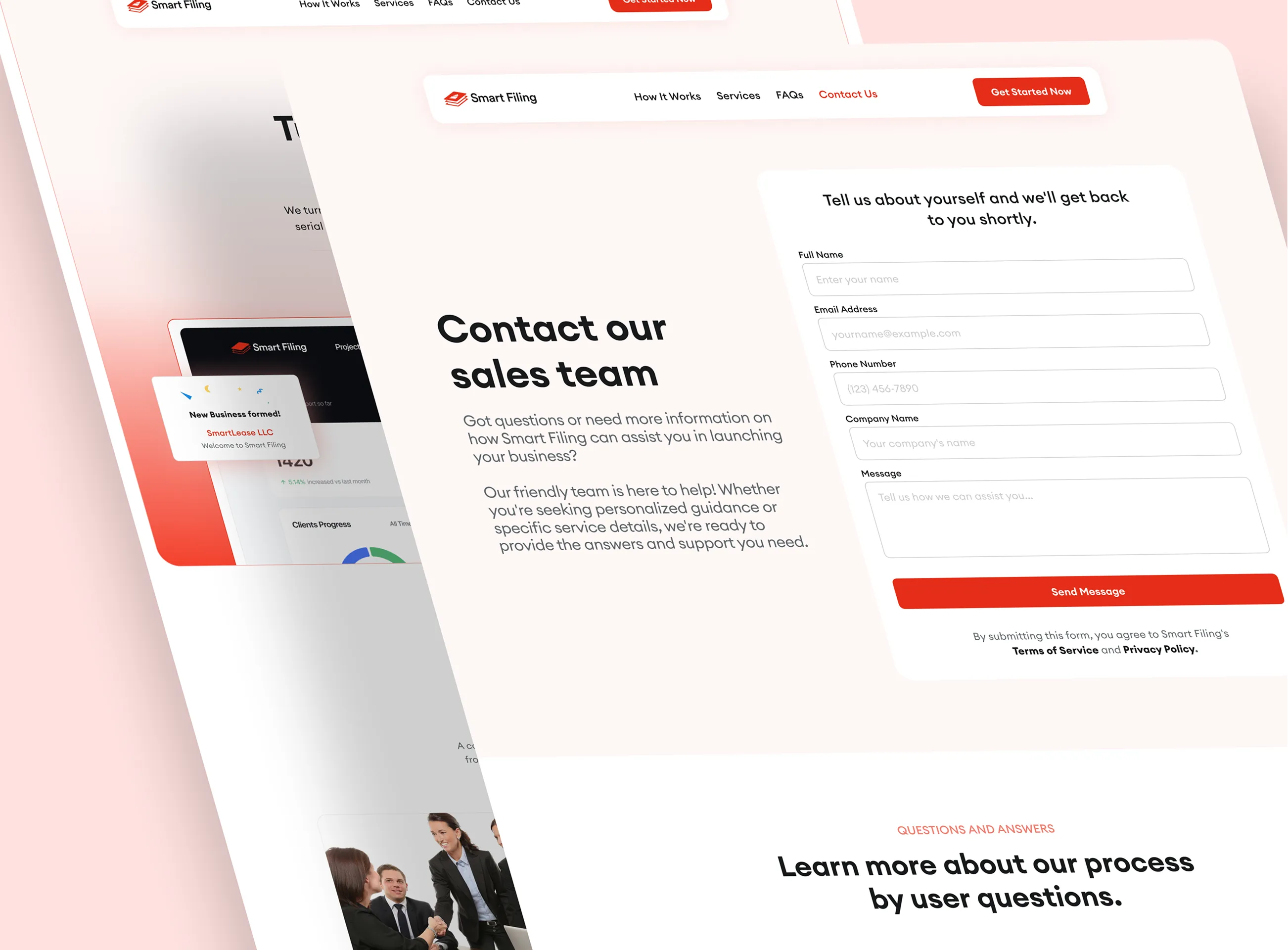
Guided Registration Flow

‍

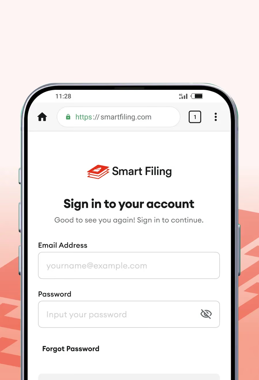
Complex legal concepts were broken into digestible steps, with explanations written in plain English.

‍

Users are guided, not rushed.

Smart Filing platform featured screen 2
Smart Filing platform featured screen 3

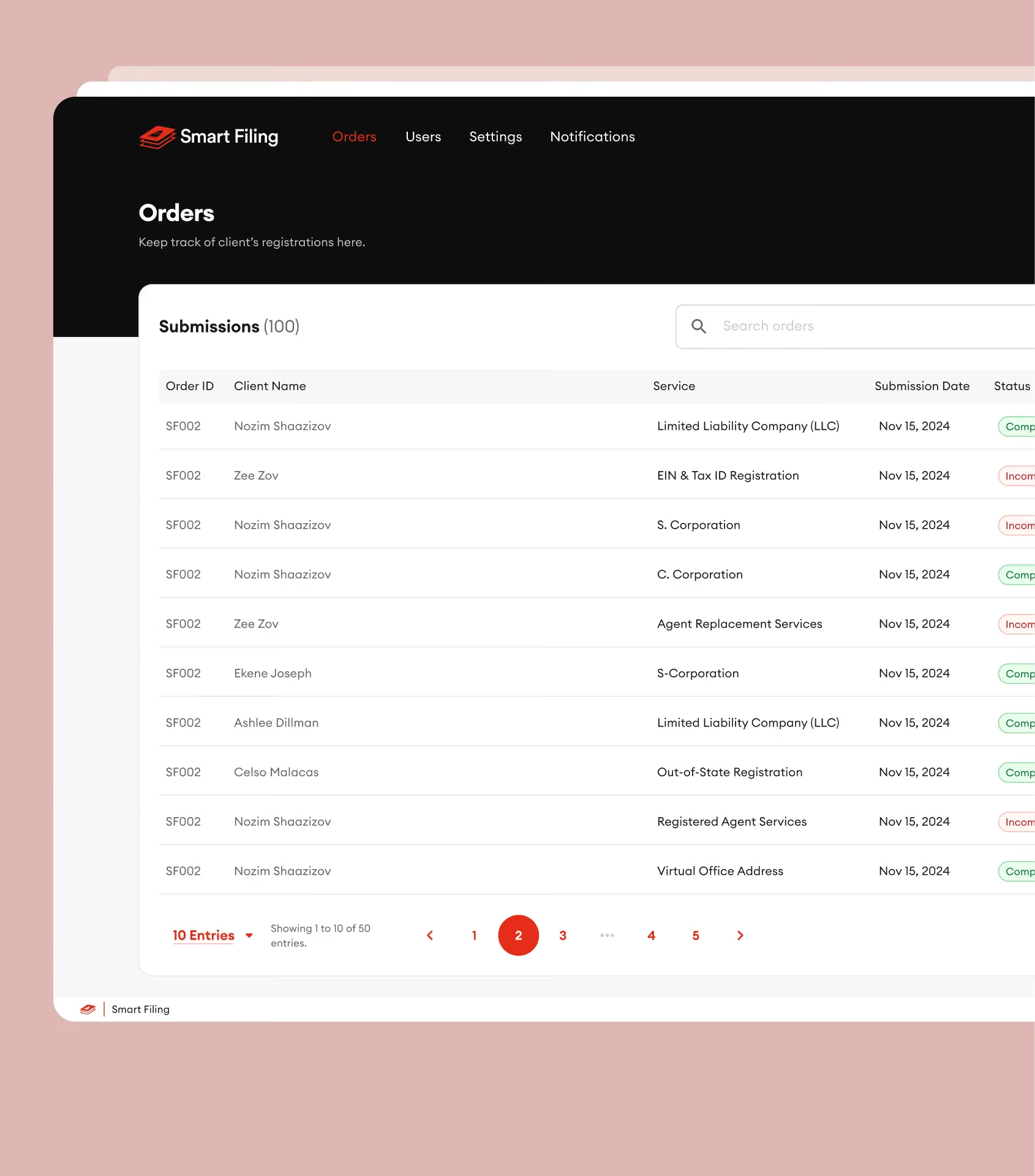
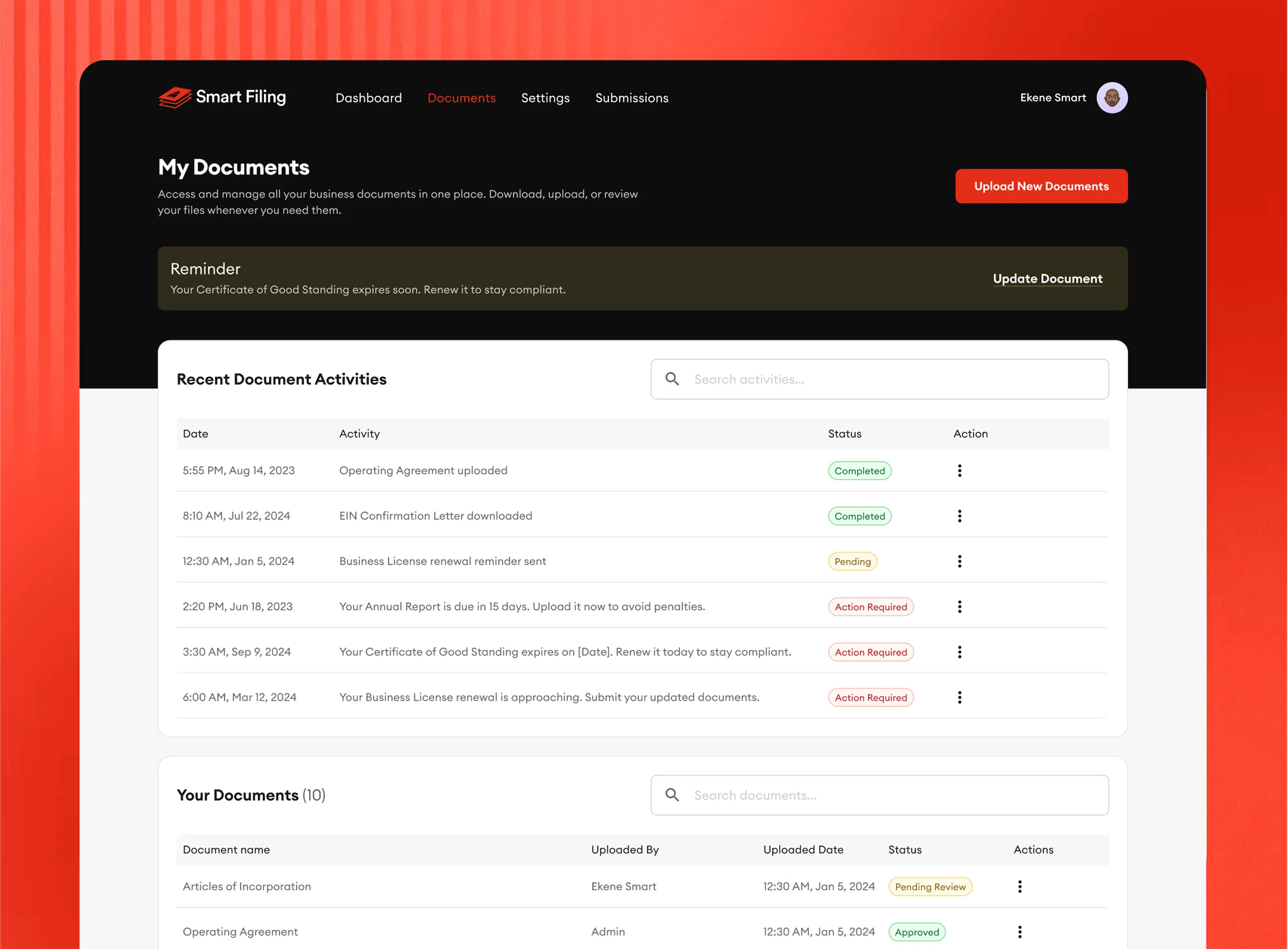
Admin Dashboard

‍

Behind the scenes, Smart Filing needed an efficient admin experience. The admin interface supports:

  • Managing multiple user applications
  • Status tracking (In Progress, Pending, Completed, Cancelled)
  • Error handling and notifications
  • Operational clarity for internal teams

‍

Designing both sides ensured the system works smoothly end‑to‑end.

04/ What changed for founders

Reflections & what I’d Improve

‍

Balancing legal accuracy with usability was the hardest part. You can’t oversimplify business registration, but you can explain it better. Scope evolution added pressure, but flexibility in the design system kept the product from feeling bloated.

‍

The redesigned Smart Filing experience turns a traditionally stressful process into something founders can complete with confidence. Good product design isn’t about removing complexity — it’s about absorbing it on behalf of the user.

‍

With more time, I’d explore deeper onboarding, smarter guidance based on behavior, expanded mobile optimization, and more automation for repeat tasks.

Smart Filing platform reflection overview
Smart Filing platform additional screen 1
Smart Filing platform additional screen 2
Smart Filing platform additional screen 3
Smart Filing platform additional screen 4

Next project

HR Management System
Web App · Webflow Build

An in-house HR Management System for AFEX, replacing costly third-party software with a comprehensive, tailored and cost-effective solution.

Joswell Ledger; Replacing a spreadsheet that lost sales
Product Design · AI Product Engineering · PWA

A family run store outgrew its Google Sheet the day a formula quietly stopped counting sales. Joswell Ledger replaced it with role based sales recording, approvals and one source of truth the whole team can trust.

Case study coming soon
Joswell Ledger desktop dashboard shown with the mobile Home and Approvals screens